
This is what Canucks jerseys almost looked like in 1989 (PHOTOS)

With all the discussion surrounding Vancouver Canucks jersey history lately, one local designer was inspired to share his story of his place in the hockey club’s fashion history.
Having rid themselves of the Flying V five years earlier, remnants of the ugliest jersey in hockey history still plagued the Canucks’ uniforms in 1989. The Flying V was still present on the shoulders of the jersey, as well as on the pants. And their primary colour for the home jersey was still yellow.
Fans love the Flying Skate jersey now, but the first iteration of it was kind of ugly, you have to admit:
April 1 1989: Trevor #Linden becomes the first #Canuck rookie to score 30 goals in a season pic.twitter.com/egoLltCTEq
— CANUCKS (@Canuckbound) April 1, 2014
Brian Burke, the Canucks’ assistant general manager at the time, made no secret about his distaste for the team’s uniforms, referring to their home jersey colour as “puke yellow.”
Jeremie White, a 20-year-0ld local designer in 1989, was able to get the ear of Canucks management. After listening to Burke’s feelings on the jersey during his regular segments on Dan Russell’s Sportstalk radio show, the local designer says he begged for a five-minute meeting with the team and eventually got it.
Jeremie eventually won the right to redesign the Canucks’ uniforms, though they didn’t use his first choice.
“The uniforms I originally proposed to Brian Burke were really a way to get in the door with the Canucks,” Jeremie told Daily Hive. “In hindsight they remind me of the San Jose Sharks west coast look they adopted a few years later.”
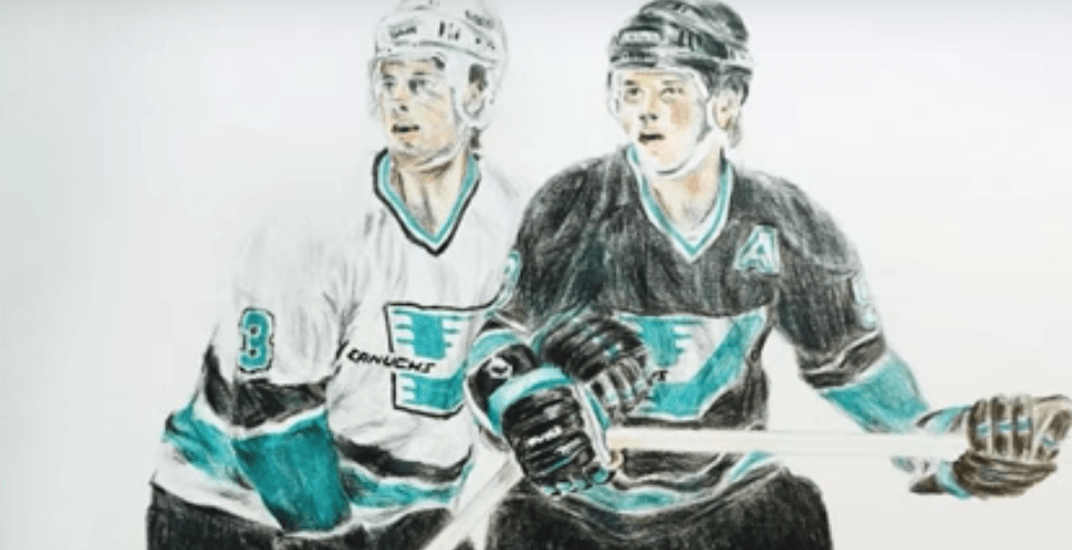
Image: Jeremie White / Sports Art

Image: Jeremie White / Sports Art
The logo left lots to be desired, but those colours would have been a hit. When the Sharks debuted with a similar look two years later in 1991, they were the most popular uniforms in North America.
So perhaps Jeremie was on to something.
Although Jeremie says that Burke really liked the design, he didn’t think ownership would ever go for a drastic change, given that they already paid $100,000 to a San Francisco design firm that came up with the Flying V. So the team’s colour scheme and Flying Skate logo – both courtesy of the Flying V masterminds – had to stay.
In a David vs Goliath showdown, Jeremie says he worked within the restrictions, going up against hockey branding superpower CCM, and won.
The Canucks removed the V from their shoulders and pants, and opted for white instead of “puke yellow” at home. It was unquestionably a positive change.

Jeremie recommended a subtle change to the team’s Flying Skate logo that the team didn’t go for. The Vancouver designer suggested removing the white lines in the background of an already busy logo, to give the skate a cleaner look.
“This was the era before HD TVs and the Flying Skate logo was difficult to see on TV,” Jeremie said. “When I was working with the club, I did propose a simplification of the logo as many people did not know it was a skate shape within the graphic lines.”
This is the logo the Canucks kept:

Image: Jeremie White / Sports Art
This is what could have been:

Image: Jeremie White / Sports Art
Or this:
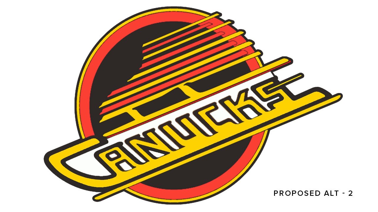
Image: Jeremie White / Sports Art
Again, I think he was onto something.
The Flying Skate jersey switched orange for red in 1992, but otherwise it remained unchanged until the Orca jersey took its place in 1997.
Given the debate that rages among fans concerning the Canucks’ current look, I had to know what Jeremie thought.
“Brands are owned by the company’s customers,” Jeremie said. “The Canucks’ brand is owned by their fans. I would listen to what the fans want and tweak from there.”
Jeremie’s a fan, so…
“Given that in the last decade-plus the team has embraced the original blue and green, I would suggest they stick with those colours. I would be inclined to revert to the Stick in Rink logo, the updated version… perhaps with ‘VANCOUVER’ arched overtop. That would provide connection to successful seasons like 2011.
“I prefer simple. Less is more.”
Jeremie still likes his Flying Skate design, but thinks it should only be used on special occasions or as a third jersey.
“You can’t continue to change the brand colours. Pick a direction and stay with it.”
And what if the team refused to remove the Orca?
“I would like to see [the Orca logo] refined and simplified. The head works but the rest could be cleaner.”
He saved the Flying Skate, maybe he can save the Orca too?
See also

Follow Channels and Categories