This map shows all of downtown Toronto's new housing over the last five years

One of the things that makes Toronto great is that a lot of people actually live downtown.
That’s not something many big North American cities – which can turn into lifeless husks after happy hour – can boast about.
Much of that can be owed to the condo boom, especially over the past half decade or so.
Using data from Statistics Canada, Tom Weatherburn of MapTO recently created an interactive map that shows just how many new housing units were built in the Greater Toronto Area between 2011 and 2016. It illustrates the changes on a block level to give a detailed overview of the city’s hot spots.
Here’s a look at the downtown core:
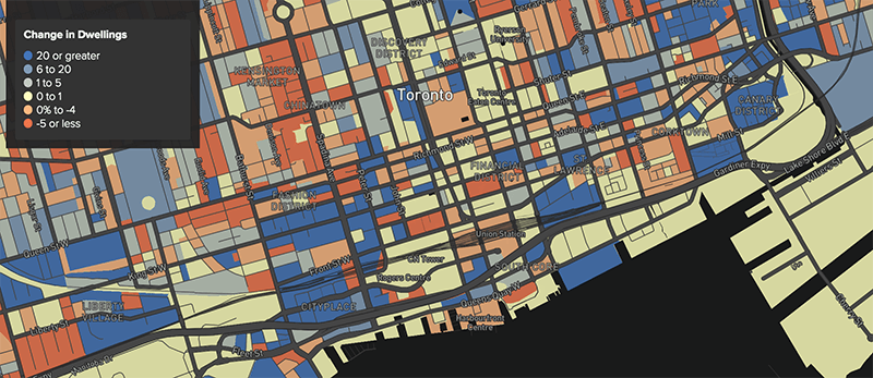
Source: MapTO, using data from Statistics Canada.
You can see that many of the condo hot spots – Liberty Village, CityPlace, St. Lawrence, Canary District, Regent Park – have seen significant increases in the number of units, but it isn’t until you explore the interactive map that you see just how significant.
Between 2011 and 2016, more than 2500 new units were built in Liberty Village. CityPlace, meanwhile, saw 2620 new units built in the same timeframe.
In the East End, the Distillery/Canary District saw around 1200 new units added to the neighbourhood, which is more than double the number of units in 2011. Regent Park, which had around 350 units in 2011, was home to almost 1200 at the 2016 census.
Zooming out, we can also identify the hottest housing pockets in the GTA.

Source: MapTO, using data from Statistics Canada.
Brampton, for example, has five blocks where more than 1000 units have been added over the past five years. Two of those blocks have seen more than 2000 units added.
Milton appears to be the hottest housing market, with around 6000 new units built in a relatively small space.
One of the most rural areas to have been rapidly developed in the last five years is Kleinburg, which has seen the construction of almost 1500 new units.
Interestingly, the map also shows where areas have lost units. One particularly “red” area of Scarborough has seen the loss of around 200 units since 2011, while it also appears that no one wants to live near York University.
New housing is encouraging, of course – now if only Toronto could work on making it affordable.
See also

Follow Channels and Categories